


Results of the artwork contest 2019 – Places 11 to 20
Here are the places 11 to 20 of this year’s Sandra and Woo and Gaia artwork contest. The submissions are ordered from place #20 to #11. All of them are truly great as you can see from my enthusiastic descriptions. Powree had a quite different opinion about some of the submissions which I found a little surprising.
Show your support by visiting the artists’ websites and/or writing a comment in the comment section of this blog post! Many thanks to all artists who participated! I love to see my characters in all these different styles and situations!
—

Place 20 goes to Cabbage
(Place 42 on Powree’s list)
Cabbage made perfect use of a reduced color palette when coloring this dynamic scene. Larisa’s flamethrower and Cloud’s backpack are also drawn particularly well. Woo’s head didn’t turn out so great, though, which made the submission lose a place or two in the end.
—

Place 19 goes to Chef cheiro (website)
(Place 17 on Powree’s list)
[Artist’s comment: The Adventure of Woo Land – A underwater battle Larisa vs Woo. A parody mash-up with Larisa as the Eggman from the Sonic the Hedgehog series and Woo as Super Mario.]
Friggin’ underwater levels! The highlight of Chef cheiro’s piece is the super detailed dashboard of Larisa’s submarine in my eyes. I also love the “L-412-15-A” caption which made me decide to put this piece on place #19 instead of #20.
—

Place 18 goes to DanFromBavaria (website)
(Place 32 on Powree’s list)
[Artist’s comment: Chill Sunday]
Here we have another submission that makes perfect use of a reduced color palette. It wonderfully captures the atmosphere of the early 60s with the old-fashioned radio and desk lamp. This is the best watercolor painting I’ve ever received as entry for an artwork contest.
—

Place 17 goes to Antoci Bogdan (website)
(Place 5 on Powree’s list)
[Artist’s comment: Just a relaxing day in the woods.]
I love the warm colors of Antoci’s drawing. Woo’s head also turned out very well, a subject many other artists often struggle with a bit. The grass also looks lovely. From a purely technical point of view, this drawing belongs in the top 10, but it’s lacking a bit that creative edge of many of the better placed entries seen below and in the top 10. Powree didn’t care a lot about that obviously and placed it on #5.
—
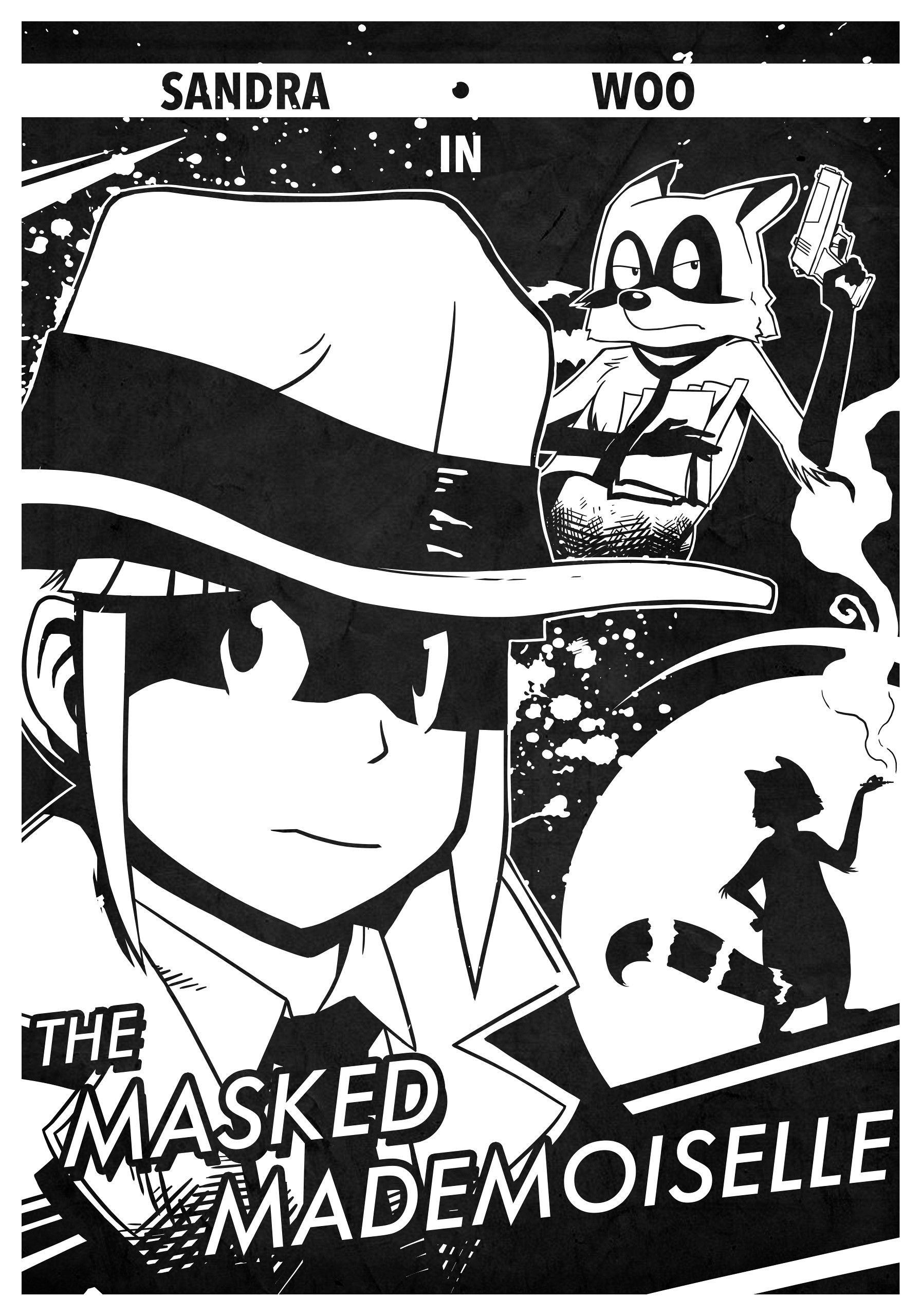
Place 16 goes to BlueTwilight
(Place 21 on Powree’s list)
[Artist’s comment: A hypothetical future chapter of Under a Killer Balloon, as an homage to old-style film noir posters.]
With all these wonderfully colored submissions, a black-and-white piece drawn with a black marker has to boast with other qualities. And BlueTwilight’s poster for Sandy South and Qoo’s new feature film The Masked Mademoiselle certainly does! The composition is very good and perfectly fits the theme. The white splotches are a nice design element, and the lettering of the movie title is also done in a professional manner.
There is also the original version which had a too low contrast in my opinion.
—

Place 15 goes to Brian_Kaes
(Place 45 on Powree’s list)
[Artist’s comment: The drawing is Sandra and Woo heading down a Japanese street… because I love the Japanese aesthetic. On second thought, it’s not hard to see Woo getting into trouble after wiping out a koi pond.]
And here we have another traditional black-and-white drawing that perfectly transports the mood of the depicted scene. I’m immediately reminded of my holiday in Kyoto earlier this year when I’m looking at Brian’s submission. I honestly don’t understand Powree’s low rating for this piece. This is one of the best instances of pencil hatching I’ve ever seen. Not necessarily from a technical point of view, but from the achieved effect.
—

Place 14 goes to melytasugondo (website)
(Place 14 on Powree’s list)
[Artist’s comment: To celebrate the 10th anniversary, I made a 10 tier cake for the cast of Sandra and Woo to enjoy and get excited about. :)]
We’ve seen a good number of submissions that were less than the sum of their parts. This piece is the opposite. You can critizise quite a few things about it: The thickness of the lines is too uniform, the coloration is simpler than that of many other submissions in the top 30, and the style doesn’t work 100% for all characters, e.g. Larisa. However, the overall impression doesn’t suffer much from it. Everything just comes together naturally with the eye-pleasing composition and the colorful but not busy coloration.
—

Place 13 goes to zuuroh
(Place 26 on Powree’s list)
[Artist’s comment: Viviana in distress.]
Zuuroh submitted this stunning portrait of Viviana in a thoughtful moment. He/She definitely succeeded in drawing her in a realistic style which is always a very hard task when it comes to characters drawn in a rather cartoony style. The lighting is also done very well. I only think that the piece suffers a bit from the clash of styles between the almost photorealistic crown, the style used for the hair, and the style used for the rest of the drawing.
There is also an excellent alternative version with a completely different lighting that you should definitely check out. There is even a third version, but I think it turned out too dark.
—
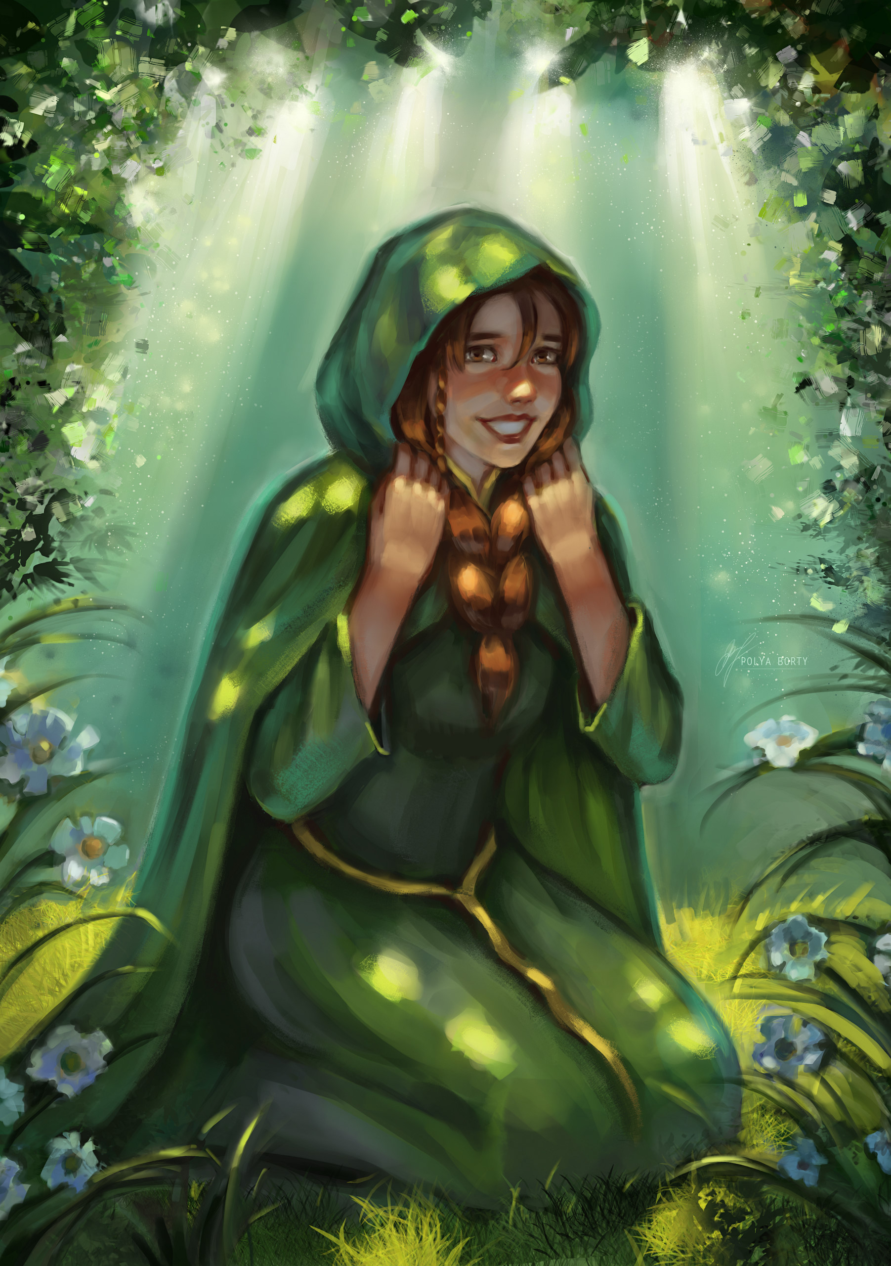
Place 12 goes to Polya Borty (website)
(Place 6 on Powree’s list)
[Artist’s comment: Malva in the forest.]
What a lovely portrait of Malva! Note the pretty sunbeams coming from above and the bold brushstrokes used for Malva. It takes a lot of skill to achieve such a great result with the used drawing technique. Another highlight are the brush strokes near the picture borders in the top half of the drawing that give the impression of crystals.
—

Place 11 goes to Lilyleaf623
(Place 31 on Powree’s list)
[Artist’s comment: Family Day]
This comic strip certainly belongs in the top 50 of the best Sandra and Woo strips published so far. It’s by far the best comic strip that has been submitted for one of our artwork contests. Woo’s kits are super cute, and Sandra is at least as cute as them. The coloration may be a bit simple, but I don’t think the piece would have profited much from a more detailed coloration. I wonder why Powree placed it twenty places lower.

Wow those are some nice contributions! There’s something about Brian_Kaes’ pencil drawing that hits all the right buttons with me; such a great mood and feel!
The level of works really goes up. In this part I like places 16, 17 and 11 the most.
Can’t wait to see what the top 10 submissions look like!