└ posted on Saturday, 16 November 2013, by Novil
About ads
I have recently received a few complaints about annoying ads on sandraandwoo.com, in particular from readers visiting the website on their Android mobile phone. I want to apologize for that, but you have to understand that it’s not always easy for me to fix this kind of problem, especially without further information about the ad. Every user, including myself, sees different ads! I have already limited our pool of ad agencies to those who offer the possibility to block certain kinds of ads (and domains) in their administration panel. Please write an e-mail to novil@gmx.de or write a post in this forum thread if you had a problem with an ad. The comment section of a comic is not the right place for such complaints.
If sandraandwoo.com is not the only the website suddenly showing popup ads or other annoying ads, it might also be possible that your Android phone is compromised. Android phones are gradually becoming the number one target for viruses and malware, including malicious apps tinkering with the web browser.
About posters
I know that there are around 20 readers waiting for their free posters. Last week, I was finally able to take the time to prepare everything, at least I thought so. I ordered and received the mailing tubes and prepared the image files. However, it turned out that the print shop wants PDF files and I’m currently a bit puzzled how to create them. I need:
2 images on an A1 print, 5 images on an A3 print, 3 images on an A4 print.The images should be enlarged (or shrinked) to fill the format, including a small white border around them.There should be no quality loss.
I looked for PNG to PDF converters but found nothing that matches my requirements since the PDFCreator is bundled with malware. So maybe I will just use Word. However, I’m afraid that will become a tedious task. But it’s probably still faster than using LaTeX… Well, if someone could give me a tip in the comment section I’d appreciate it. If someone could do the whole conversion for me that would be even better. If you’re eager to help, write an e-mail to novil@gmx.de.
Update: I used Scribus as recommended by a few readers. Thank you for all your suggestions!
About Larisa’s secret
Many of you wonder if Larisa’s “big secret” is related to her behavior in [0126] Secrets. While I don’t want to talk about that in particular, it certainly appears odd that I haven’t written a story arc about Larisa’s background in all these years since [0126] Secrets was published. The reason for that is that I started to like the story arc that I had originally planned less and less and eventually decided to ditch it. I’m sure that many of you would not have liked that story arc or even hated it as well. I can therefore only ask for your patience until I’m able to come up with a story arc of the usual quality you can expect from Sandra and Woo.
└ posted on Tuesday, 12 November 2013, by Novil
Since nobody visits our forum (I’m not particularly sad about that since I’m not fond of moderating forums.), I decided to publish some of my most interesting forum posts on our homepage over the course of the next weeks.
Here you can see two comic strips I drew when I was 11 years old. I was a huge fan of the European Donald Duck and Mickey Mouse comics at that time, but I also liked to read Peanuts, Garfield and Hagar the Horrible. I was maybe better at drawing back then than I am now. I often copied drawings from the comics I read and also created a couple of original comic characters. I rarely drew complete comic strips, though, and my main interest gradually shifted towards PC games and playing tennis. Today, I would be able to post my comics and drawings on DeviantArt, reaching a much larger audience than just my mother. Maybe I wouldn’t have lost interest in creating art with today’s possibilities.


When I was in my twenties, my interest in creating comics grew again. At least a year before the start of Sandra and Woo, there was a feature on Halfpixel.com called Time Friends. Basically, you could insert your own dialog into the empty speech bubbles of the template strip you can see below.


└ posted on Sunday, 3 November 2013, by Novil
Sandra and Woo celebrated its 5th anniversary on 19 October 2013. That was not the only reason to celebrate for us, though, since October was also the best month for Sandra and Woo with respect to the number of visits per day (19,963) and page views per day (130,854). Gaia also saw the largest number of visits per day (9,682) so far. Click on the diagram for the full-size version of the image.

I’d like to thank everybody who spread the word about our comics! Putting a link to our webcomic website(s) on your Facebook page, Twitter stream, blog or website is an easy and extremely effective way to support us!
└ posted on Monday, 28 October 2013, by Novil
I found some new pieces of fanart for Sandra and Woo and Gaia. A thank you from me to all the artists!
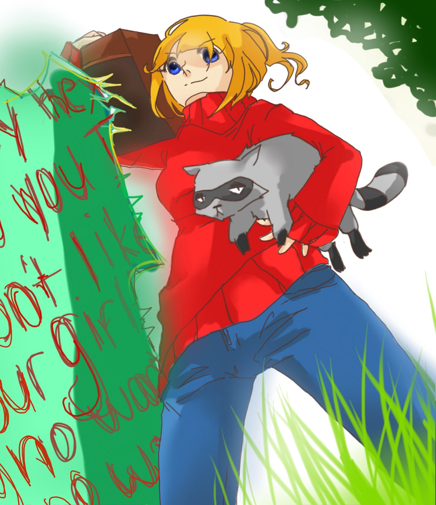
Sandra and Woo fanart
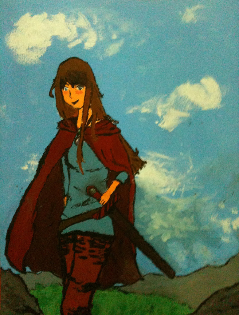
Gaia fanart
└ posted on Friday, 25 October 2013, by Novil
Sometimes, the sketch for a comic page has a certain flow to it that is hard to conserve when drawing the final page with clean lines and more details. It is a challenge that every comic artist faces once in a while, and sometimes even the best artists fail. However, it is usually not quite as bad as in the following example posted by the artist of Alex ze Pirate, Tom Preston.
If you check the news archive, you will see that I have never commented negatively about the work of a fellow cartoonist. But I am still puzzled how a professional artist can make so many bad decisions that turn a really good sketch into a mediocre comic page. One also has to think about all the time that was spent on redrawing various parts of the page. Since one can also learn from bad examples and there are lots of comic artists among our readers, I decided to post my observations here.

Here is my opinion about each panel of the final page:
- Panel 1: The boy’s pose looks much more dynamic in the sketch. Unlike in the finished page, he’s swinging the axe in a sensible way so that it has a considerable amount of momentum when hitting the trunk. In the finished page, the axe also seems unrealistically large.
- Panel 2: This panel should not have been added since it adds nothing to the story and rather slows down the action. It also takes away valuable space for the swing of the axe in panel 1.
- Panel 3: The composition of this panel is better in the sketch with the top of the trunk at 1/3 of the panel height and the center of the boy’s legs at 2/3 of the panel width. The different camera distance also adds a little visual variation.
- Panel 4 + 5: The second sketch has the best version of these two panels. The progress from a larger to a smaller piece of wood is shown and the boy is pushing the knife with more strength, making the carving process look more natural.
- Panel 6: I like how the boy looks with pride at his finished creation in the sketch. The artist is thus connected with his creation in a concise way. It also works particularly well together with the next panel in the sketch.
- Panel 7: I like how the boy casually throws the created piece into the fire with an empty facial expression in the sketch. The contrast to the boy’s expression in the previous panel will certainly surprise the reader.
- Panel 8: The smile of the woman looks funnier in the sketch. Giving her such a sexy pose in the final artwork also distracts the reader from the punchline. Some people may see it differently, though.


